Thursday, 21 April 2011

Evaluation

1. How Effective is the combination of your main product and ancillary texts?


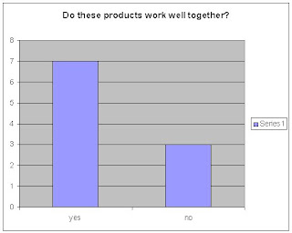
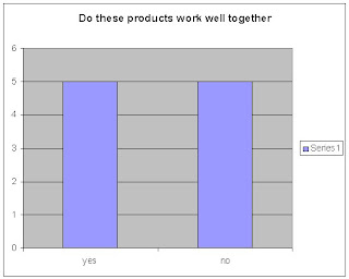
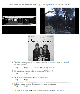
I sent this questionaie out over differnt type of platforms for exmaple I sent some over Emails some by hand to some students at school and some to my family. Doing it this way let me get a larger range of opinions.

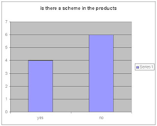
I made graphs on the results i got back.
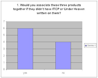


Question 1.


Question 2.


Question 3.
Question 4.


2. In what ways does your media product use, develop or challenge forms and conventions of real media products?


RESEARCH AND PLANNING
Internet:
http://www.youtube.com/
http://www.imdb.com/
http://www.paramount.com/
http://www.cineworld.com/
http://www.picturehouses.co.uk/
http://www.odeon.co.uk/
I used these websites as a base to my help me with my products, they gave me ideas in to what i think it should look like and how certain aspects of the products. Also it gave me ideas of certain conventions I should use in my products.
http://www.blogger.com/
I used blogger as a basis to keep a record of my progress along the way to store information on what I am doing in my research and planning stages.
Computer Software:
Microsoft Word
Microsoft Excel
Paint
I used these to help me with different aspects of my research and planning for example Microsoft word was used to make the questionnaire and Excel was used to make the graph.
Venn diagram:
The Venn diagram was used at the beginning of my research to give me a wide range on what certain genres give also what either both or all three have in common.

Other:
Digital Camera
Video recorder

EVALUATION

Internet:
Blogger.com
I used blogger to show what I have been doing within my evaluation.

Computer Programmes:
Microsoft WordMicrosoft Excel
Microsoft Word was used to make my questionnaire and also it was used to spell check everything, and Microsoft Excel was used to make the graph from the data i got from questionnaire.


3. How did you use media technologies in the constructions and research and planning and evaluation phases?


Film trailer
Key:
Conventions of my Media Product
Conventions of real media texts


Logo

Small and would suit all genres
Challenges
Mysterious and spooky and fills the screen


Font

White font black background
Uses
White font black background

Uses lower case
Challenges
Have used capitals


Characters

Attractive brunette female
Develops
Attractive blonde female

Casual clothing
Challenges
Formal clothing


Shots

Long shot
Uses
Long shot

Fairly bright lighting
Develops
Dark lighting


Setting

Forest
Uses
Forest

Open forest
Develops
Isolated misty forest


Poster

Shows main characters, title and also the name of the movie
Uses
Shows main characters, title and also the name of the movie

Blank background
Challenges
Show main settings


Website

Shows trailers from the maker
Uses
Shows trailers from the maker

Has the logo of the company
Uses
Has the logo of the company

Drop down menu
Develops
Hyperlinked menus


4. What have you learnt from your audience feedback?


Monday, 21 March 2011

Finished Teaser Trailer

This is my Finished product of my teaser trailer:


Tuesday, 15 March 2011

Editing on the Trailer

Editing
After I had finished my filming I needed to cut down all my clips in to individual scenes. I had done this by using the "Cut" tool to shorten the clips to what I needed. Once all the clips were individually cut I had to then sort them out into the correct scene order, I just dragged them from their positions to the order I wanted them to. After it was in order I needed to place transitions in, I thought about having no transition, just cut shots as this can create the tension I want in some shots, I then went with "Addictive Dissolve" which fades the end of one shot and the beginning of the next in to a smooth transition, I didn't apply this to all only some as it would have been to much and repetitive. Some shots I used a straight cut shot as it made it look quick and clean, it also creates the effect of suspension and tension.

Music

Once all my shots were together and the transitions had been placed in the correct positions I had to think about what music to put over or even to have music.
Firstly

I had tried with no music just letting their being diegetic sound of the clips, but these went that clear so this wasn’t ideal for my trailer.
Secondly

I tried no diegetic sound and non-diegetic music over the top, this sounded ok but I had to turn down the diegetic sound and turned up the music, this worked better as it made u feel like the trailer was more suspicious and weary. I didn't really like this affect in the end as the diegetic sound over ruled the music however turned down the sound was.
Thirdly

I had just non-diegetic music and no diegetic sound, this worked really well as the music flowed with my shots and transitions. So this was my final chose as the music by itself created the most dramatic affect along with the tensions and suspicion.


Post Editing

After I finished my editing and music i watched my film through once again. Whilst watching i was taking down notes on to what i could change or improve, things that didnt seem to fit the trailer. I watched it through a few times looking at differnt possibilitis and effects i could use in a newer version.


I changes some of the shots but none of the transitions. I ended up only changing one shot, which i think is the most important shot in the trailer, i slowed it down by 40% which added length and also created a really nice effect of motions and the way the music flows with the slow motion.

Friday, 4 February 2011

Evaluation of First Draft

Looking at my storyboard I have realised that I have left out some vital information with the shots and the transitions between, so I am going to create a second draft that will be an improvement of my first storyboard.

Wednesday, 26 January 2011

Storyboard

I have just finished my storyboard but looking over the final piece I think it would be sensible to make a second draft of the storyboard.

Below is a draft of my first storyboard:


Monday, 24 January 2011

Evaluation of setting

Looking at all of my possible locations shot I have taken, I think I have a good collection and am ready to start filming in some of these locations. I may have to change some of my locations due to weather conditions or flooding due to the rain.

Thursday, 13 January 2011

Setting - location

Today I started to think of locations of where I could film. Some of my ideas of were I could film came from places I have previously been and others people have suggested to me.

Initial Ideas:
-wooded area
-river bank side walk
-Walk way -grass path
-empty house
-built up estate
-field


Here are some of the possible locations below of where I could be filming.


This wooded walkway is a very nice shot with the light and how in draws attention to how the path way goes all the way down the forest. I will use this shot when I film my shot of the couple walking down the walkway as it creates a peaceful atomosphere.

This is another shot of a walkway but is a bit duller but the walkway looks more attractive, I don’t think I will use this shot due to the fact that it is not long enough for my shot and also the trees are not the right distance close to each other to create a archway.


I took this shot of a meadow near my house; I chose this shot because how the forest in the background brings forth the foreground were my actors will be recorded. I will use this shot in my trailer as it will make the couple much more distinctive.


This view of an estate was taken when i was going through a town called haverhill, i was thinking of using this area to shoot


This shot of a walkway along a river would make a really good shot for my films as the light reflecting of the water makes the shot more peacful and tranquil. im not sure if I would use this shot in my traler due to the fact that the path isnt wide enough and also the tree line os to close to the river.

Wednesday, 12 January 2011

Storyborad

Storyboard Finished

I have finished my storyboard after discussing with peers and teachers of what shots would be appropriate for the film and what editing would be good between the shots. I haven’t decided on what music would go best with shots, but i will decide closer to the time of finishing my film. I will test many possible music choices to see what goes best with the whole film and certain shots.

Thursday, 16 December 2010

Poster Design


I took these pictures for my poster; I got some inspirations from some of the other posters I researched in my blog.


I took two pictures just to make sure the contrast the angle of the shot and the tone was correct. My second Picture will be the one I use for my Poster I think as it has a darker contrast than the first. This would be good for my poster as it will give the effect I want.

Completed Website

I have finished my Website which has many features on it.


Below is a picture of my finished website:


Here is a link to my website in which you can view the whole site.

www.wix.com/alexmutu123/ITCP